Mobile Home Screen Redesign: From Proposal to Launch
My Role: Strategy, Lead UI/UX design, prototyping, user research
Design Collaborators: Tony Dihmes, Mark Stuenkel, Preethi Raju, Leslie Davisson
Highlights
🌟 Design-Led Success
Launched the first design-led initiative, showcasing the power of a human-centric approach.
📊 Impressive Results
+25% increase in remote visits and +15% increase in the ratio of remote visits vs. video chats.
💡 Collaborative Insights
Stakeholder round table brought together diverse perspectives from product, clinical, marketing, and strategic ops.
🎯 Primary Goal
Empower members to stay on top of their health through meaningful actions and clear navigation.
🔍 User Research Findings
Identified key pain points and preferences, guiding the redesign. Conducted Rapid iterative testing to refine content hierarchy and design direction.
🏗️ Information Architecture
Explored various approaches, balancing business goals and improving the member experience.
🎨 Visual Explorations
User testing helped narrow down the look and feel, validating design instincts and building trust with product leaders.
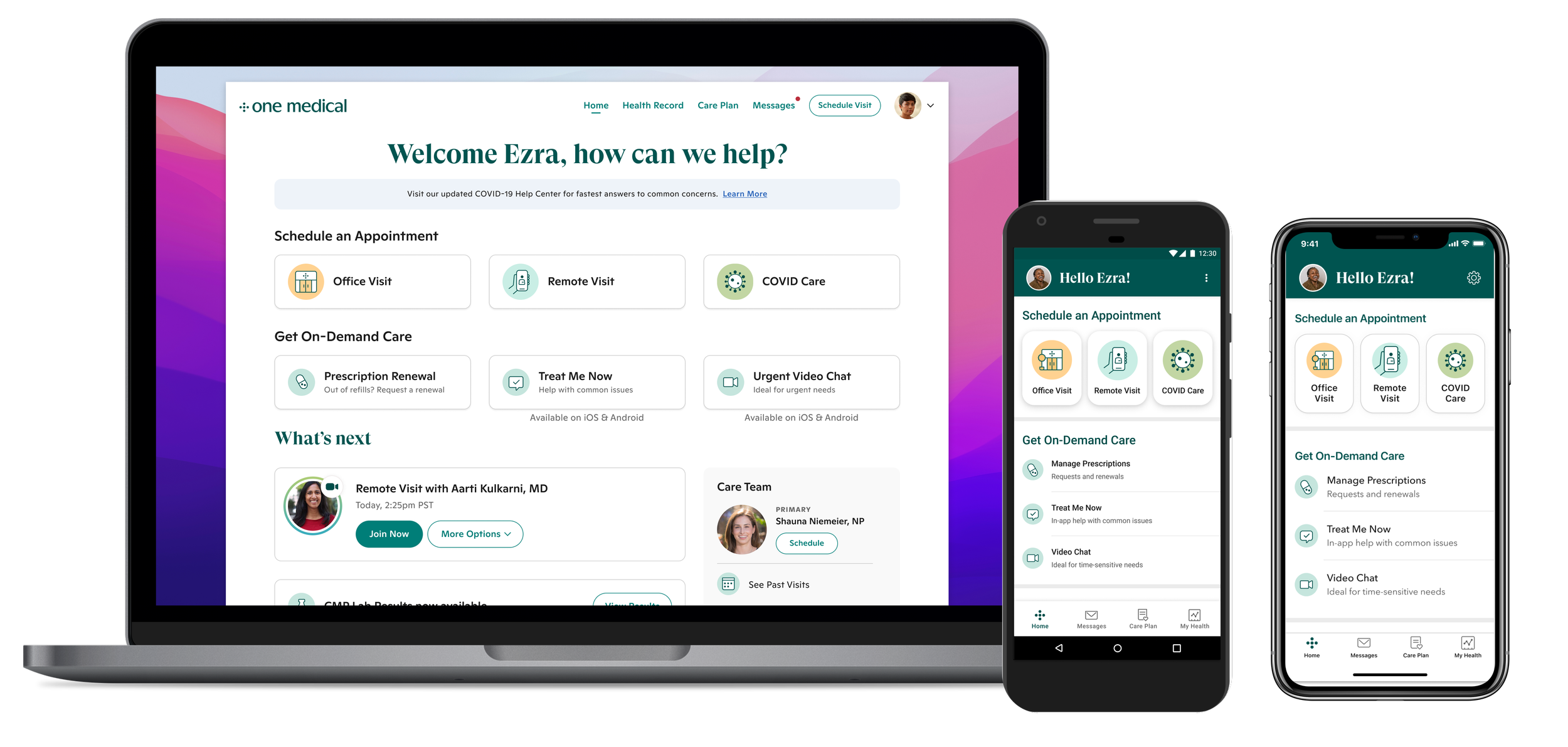
🌈 Full Platform Redesign
The success of the Android home screen redesign led to a full redesign across all platforms.
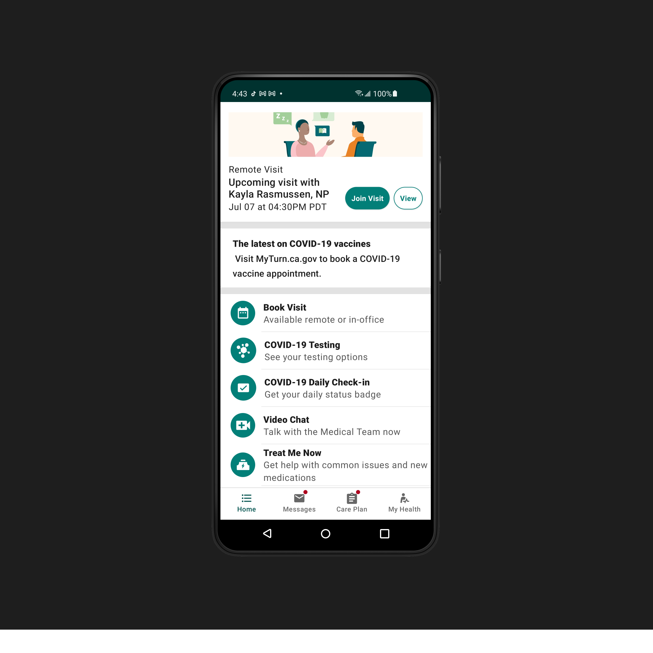
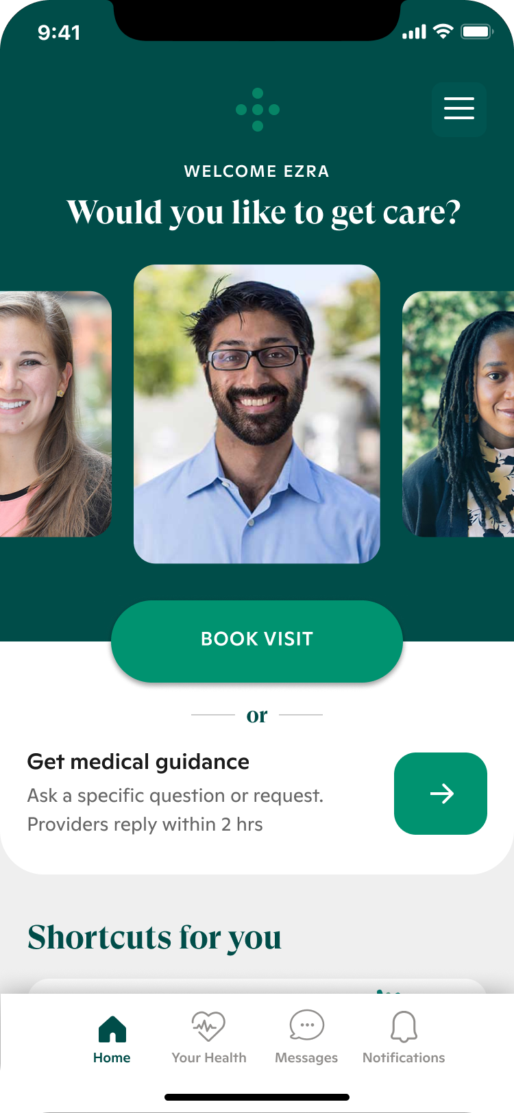
Before Redesign

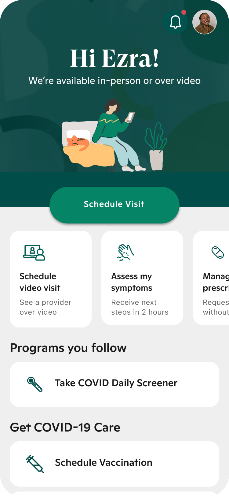
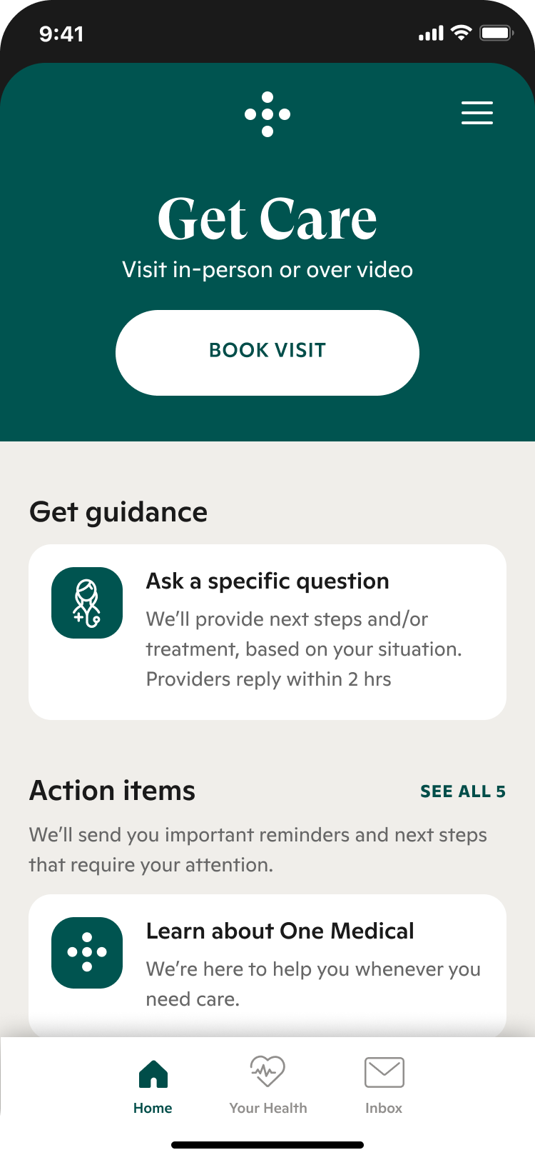
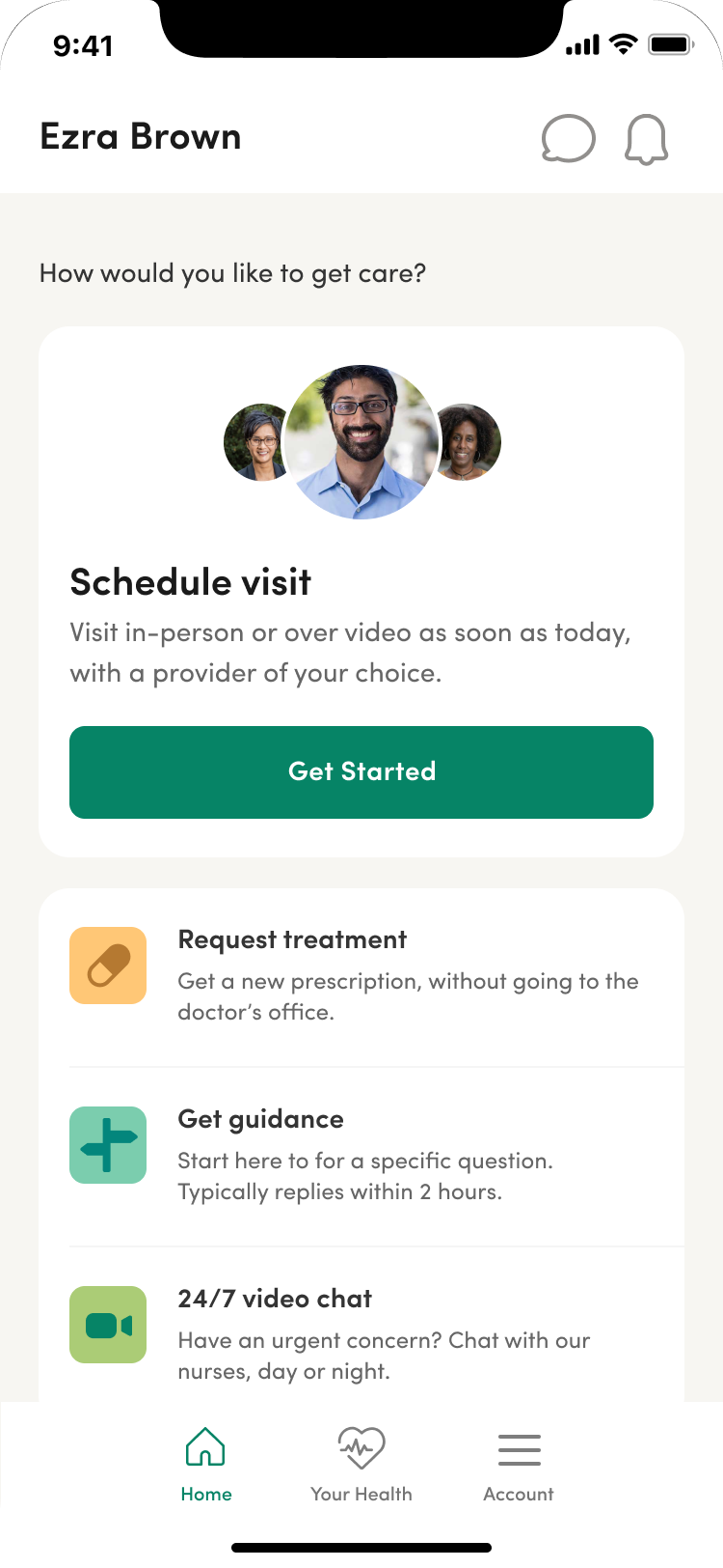
After Redesign
Initiating Change: My journey to Redesigning One Medical’s App
As a Lead UI/UX Designer committed to creating welcoming, human-centered digital healthcare experiences, I recognized that the One Medical mobile app's home screen faced significant usability issues.
The lack of a clear hierarchy made it challenging for members to locate key services, hindering the app's scalability and compromising the experience.
To create a more inclusive, empathetic, and seamless experience, I proposed a comprehensive redesign focused on prioritizing relevant health-related actions.
By establishing a clear hierarchy and intuitive navigation, we aimed to empower individuals to take control of their health journey with confidence and ease.
Piecing Together a Shared Vision
To bring this design-led vision to life, we facilitated a round table discussion with leaders from product, clinical, marketing, and strategic ops. By gathering unique perspectives, we aligned on the primary goal.
In this round table, we asked leaders to reimagine the app’s home screen with these 4 prompts:
The non-negotiable: What's crucial for the home screen?
The Delighter: What could set us apart from other healthcare companies and why is it valuable for members?
Dream bigger: Describe the coolest home screen experience without constraints.
If we did nothing: What challenges arise if we make no changes to our current experience?
We established the following goals for the redesign:
Primary Goal: Empower members to manage their health effectively through meaningful actions and clear navigation, prioritizing remote visit scheduling over other services.
Secondary Goals:
Scalability: Build a solid foundation so our product teams can efficiently and confidently add new content and features.
Member Experience: Improve our app’s visual appeal and IA, and align with our marketing brand identity.
Digging Deep with User Research
As part of this design-led initiative, our team analyzed prior research and conducted a new benchmarking study to identify key pain points in the current home screen experience.
Insights
Members seek a caring, premium experience.
Members don’t understand our digital offerings, especially Treat Me Now and Video Chat.
Members have different preferences, which can also be influenced by health conditions and urgency
We need to better guide members to the right service

Balancing Business Goals and User Experience Through IA
We explored various IA approaches to balance business goals with an enhanced member experience.
Refining IA through Rapid Iterative Testing and Evaluation (RITE)
We conducted a RITE study, which enabled us to get clarity on the content hierarchy.
This process involved 3 rounds of interviewing 2 participants daily, with 2-3 days dedicated to design iteration between testing sessions.
Insights
Get Care - Create a dedicated space to access key services
Engage our members through expert clinical guidance (curated reminders, recommended services/resources)
Account - Simplify by consolidating settings, account, and profile in one place

Visual Design: Bringing Our Shared Vision to Life
Narrowing Design Direction through Research
Using Google Forms and Mechanical Turk, we were able to get clarity in the following ways:
Look and Feel
Using visual design to add more affordance to our top services
Copy improvements (e.g. adding “Urgent” to “Video Chat”)
Icons vs. Illustrations vs. Photography
Despite the challenge of running multiple preference and task tests, user feedback validated our design instincts and built trust with product leaders through a transparent, data-driven approach.


🎉 Launching with Impactful Results
+25%
Increase in remote visits
+15%
Increase in ratio of remote visits vs. video chats
The resounding success of our Android home screen redesign sparked leadership's enthusiasm, leading to a full redesign across all platforms. This project exemplified the power of human-centered, data-driven design in driving business success.
By prioritizing our members’ needs and collaborating cross-functionally, we created an intuitive mobile experience that delivered meaningful results.
Ready to embark on your own design-led transformation? Let's connect and explore how we can create delightful, impactful experiences together!
What team members are saying
-
"Kim has delivered a strong vision for the mobile home screen over the past 6 months, with an eye on qualitative and quantitative feedback. She has collaborated with marketing actively to ensure the work is on-brand as well as usable."
-
"Kim has been an instrumental design leader in several projects spanning outside her own department team, guiding and directing everything from our brand direction to overall product and UX strategy behind the mobile app redesign. She is a strong-voiced, strong-willed design leader who constantly pushes me and the team to put our best selves into our work and deliver the best possible experience to our One Medical members and patients."
-
"It has been great to see the app home screen project unfold. The process from the beginning has been very impressive and thorough. I have always had a lot of respect for our member design team. It has been awesome to see what they can do when firing on all cylinders on a big ambitious project with Kim in a lead role."
Learnings for Future Design-Led Projects
What went well
Stakeholder Engagement: Engaging stakeholders throughout the process and using data to convince them
Cross-Functional Partnerships: Fostering strong partnerships among product, design, and engineering
Data-Driven Insights: Collaborating with Product Operations (POPS) for data analysis expertise and meaningful insights
Diverse Skill Sets: Building a team with diverse, complementary skills
Comprehensive Testing: Combining qualitative and quantitative testing methods to build confidence in the product
Verbatim Feedback: Gathering poignant quotes from research participants for nuanced insights and larger themes
Cost-Effective Testing: Utilizing Mechanical Turk and UserZoom Go for cheaper, faster testing
Focused Prioritization: Aligning on key journeys of focus and defining principles to prioritize problems
Rapid Prototyping: Using rapid prototyping to build internal excitement and alignment
What could we have done better
Dependency on External Marketing Resources: Limited access to in-house creative work (photos, illustrations, etc.) due to reliance on freelancers
Challenges in Pushing Beyond MVP
Pre-production testing felt like it had to be 'perfect,' even though there will be time for post-launch improvements
The team wished for more non-MVP features to push the experience forward
Notification system for new features, reminds, and personalized content
Discovery/services view for personalized recommendations
Clarify and simplify virtual service options, guiding members to the most appropriate care based on their needs (e.g., Video Chat, Treat Me Now, or Remote Visit).
We lacked the time to build the next steps post-MVP (towards the ultimate vision)
Insufficient Testing Strategy and Alignment
The research portion far exceeded what was scoped time-wise
Setting up initial tests can be time-consuming and needs more support
Aligning on testing strategy earlier would have saved time and energy
A clear stance on when tests had acceptable or actionable results was needed
The project would have benefited from a dedicated researcher and content strategist