Trunk Club Stylist Shopping: Empowering Personalized Wardrobe Curation
My role: UI/UX design & user research
Highlights
🛍️ Personalized Shopping
Designed an internal shopping experience that contextually highlights member needs, history, and preferences.
📈 Measurable Impact
Increased item keep rate, reduced shopping time per member, and streamlined new stylist training.
🔍 User Research Insights
Uncovered top problems in stylists' workflows through shadowing and synthesized findings to guide design.
✏️ Iterative Design Process
Sketched concepts, created user flows and wireframes, and gathered feedback to refine the experience.
🖥️ Intuitive Interface
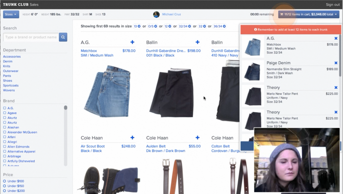
Developed a multi-panel layout allowing stylists to reference member information while focusing on shopping.
🧪 Data-Driven Optimizations
Collaborated with business intelligence to add contextual recommendations, improving keep rate.
📚 Style Guide Creation
Established a UI kit and CSS style guide, enabling rapid development and launch within 3 months.
🚀 Successful Launch
Played a crucial role in Trunk Club's growth, doubling in size and expanding to 5 U.S. locations post-launch.
Understanding the Challenges: Stylist Shopping Workflow
As a Product Designer at Trunk Club, I recognized that our stylists faced significant challenges in curating personalized wardrobes for their 600+ members (each). Shopping within a typical E-commerce experience was insufficient, as stylists struggled to remember each member's requests, style preferences, wardrobe, lifestyle, and sizes.
To create a more efficient and effective shopping experience, I set out to design an internal tool that would contextually highlight a member's needs, shopping history, and style/size preferences, empowering stylists to build personalized trunks with ease.
Uncovering Insights Through User Research
Before designing a solution, I immersed myself in the stylists' daily workflows through shadowing sessions. This allowed me to uncover the top problems they encountered in their shopping experiences.
Key Takeaways
Stylist Challenges
Matching clothes to members' fit and style preferences to increase keep rates
Staying organized, on task, and effective while shopping for 600+ members
Current State Limitations
Multiple apps and Post-it Note reminders used to manage book of business
Insufficient support from existing apps like Salesforce
Hacked-together internal apps supplementing a broken shopping experience
Essential Member Information for Personalized Trunks
Wardrobe Items owned from Trunk Club or other sources
Preferences Likes, dislikes, and preferences for style, brand, fit, and price
Needs Wish list, requests, and unspoken desires
Desired Shopping Experience
Streamlined flow to help stylists stay organized, on task, and effective
Seamless access to essential member information for efficient personalized trunk curation
Iterative Design Process: From Sketches to High-Fidelity Mockups
Equipped with research insights, I began the design process by sketching a wide range of concepts and gathering team feedback.
Crafting User Flows: Uncovering Missing Pieces in the Experience
Next, I created user flows and low-fidelity wireframes to identify any missing pieces in the experience. Through testing with stylists, I discovered that shopping needed to be more prominent than member information.
Pivoting Wireframes: Prioritizing Shopping Over Member Info
Through testing with stylists, I discovered that shopping needed to be more prominent than member information.
Member Preferences for Tailored Curation
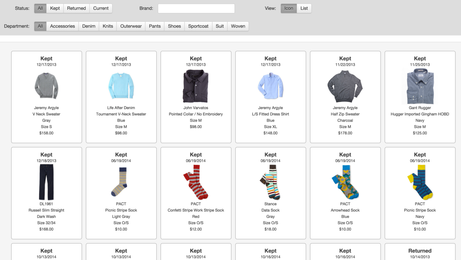
The final design featured a side panel that allowed stylists to reference member information while focusing on shopping. Stylists could view items members liked and disliked, enabling them to make informed decisions when curating trunks.
Another huge win with the multi-panel experience was that stylists could easily visualize which items would make a great addition to an existing wardrobe. Also, it was easier to avoid choosing items that members would dislike by seeing a member's past dislikes and new items side-by-side.
Data-Driven Optimizations
Beyond the foundational E-commerce platform, I collaborated with the business intelligence team to introduce data-driven optimizations, such as:
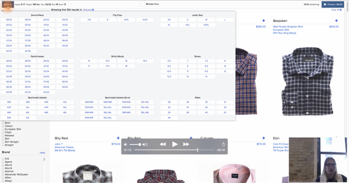
Size recommendations based on customer data
Contextual product recommendations based on similar member preferences
E.g. If a member is usually a size small, but brand x tends to run small, get a medium.
We also iterated and launched a panel that surfaced the original member request. This helped stylists to remember to get the items that their member wanted.
Another impactful experiment was to surface more contextual product recommendations. E.g. We would make recommendations based on members that had similar taste to each other. In turn, this increased keep rate.
Style Guide Creation
To ensure a smooth and rapid launch, I created a UI kit and CSS style guide for the developers, streamlining the development process. (We were able to launch within 3 months end-to-end.)
User Testing with Dynamic Prototypes
Once the high-fidelity mockups were finalized, I created clickable prototypes for user testing. However, to accurately test interactions with dynamic content like adding items to the cart, we pivoted to rapidly building functional HTML prototypes. These coded prototypes allowed testing the real experience of browsing, adding products, and observing dynamic content updates based on user actions.
🎉 Launching with Measurable Impact
After much testing and validating the design, I worked closely with the product manager and engineers. Together we created an agile release plan to make what is now the Trunk Club stylist shopping experience.
Results
Increased item keep rate
Reduced time spent shopping per member
Reduced new stylist training time


